SYNOPSIS
The brand was updated with a corporate and confident feel, the logo was made cleaner, whilst maintaining the original aspects of the logo. The colour palette, includes two subtle shades of blue with one bright blue as an accent colour, to continue the concept of energy.
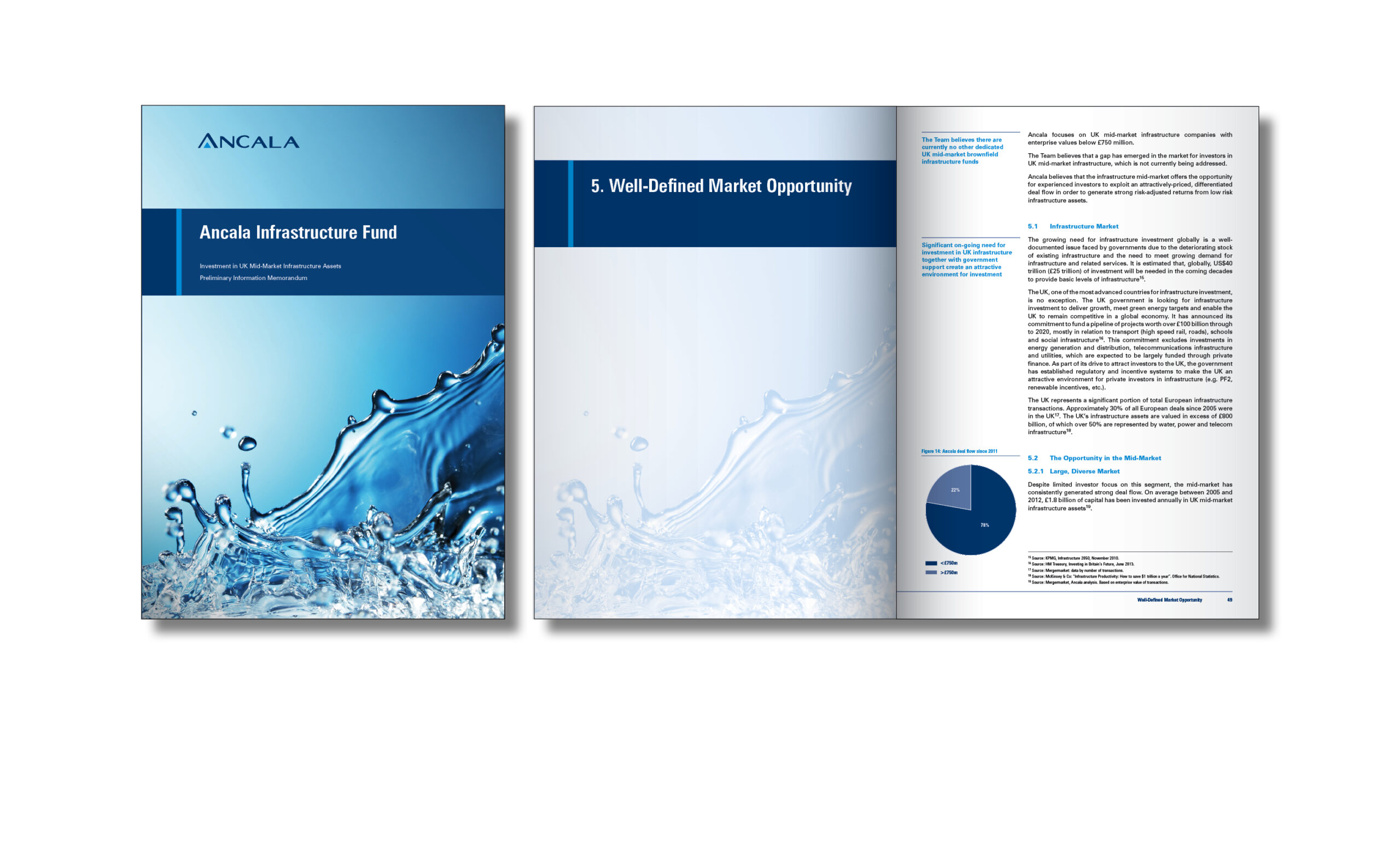
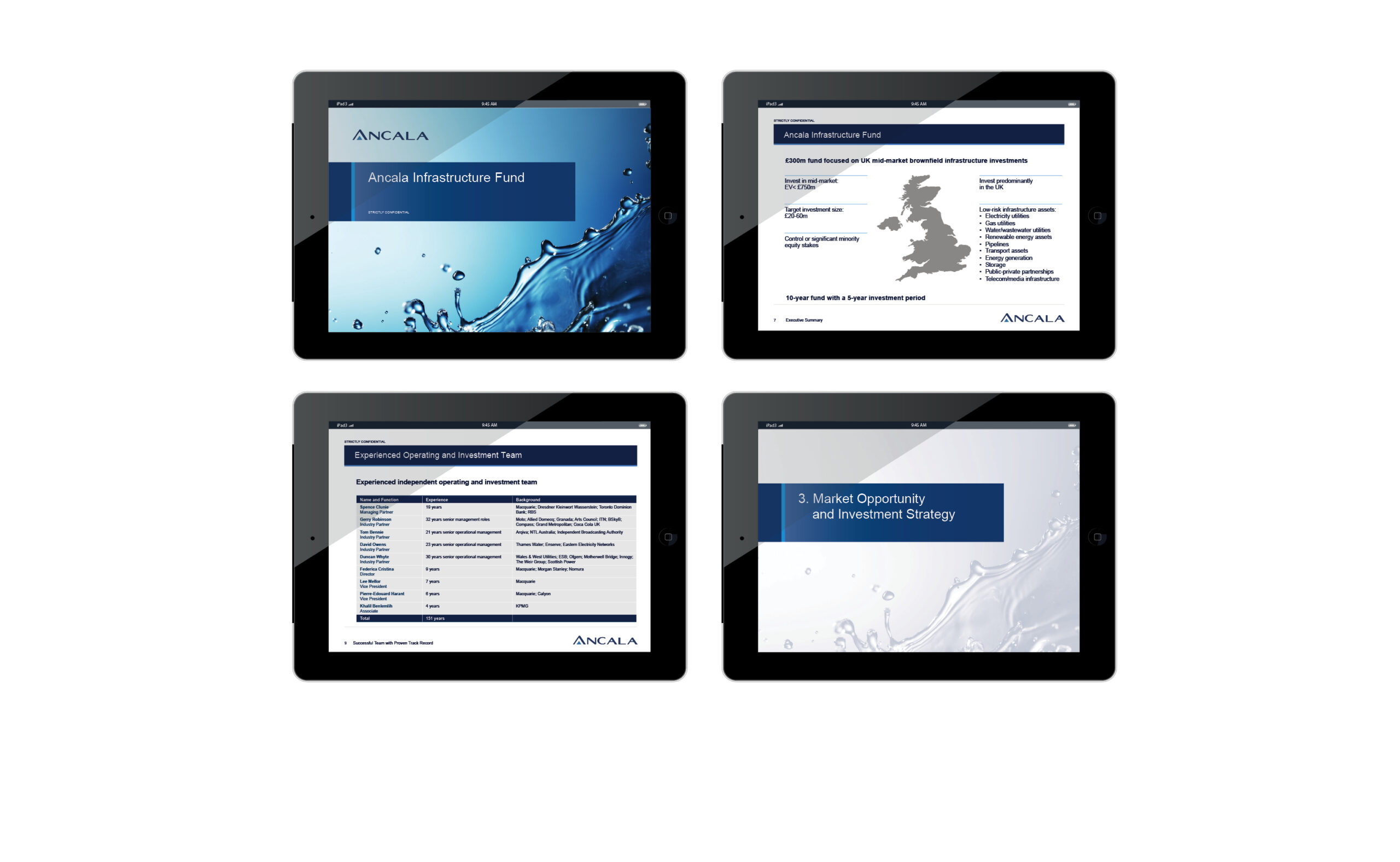
For the collateral, structure was designed with a core graphic element, to sit with the water image, also designed to hold the document titling. The preliminary information memorandum spreads are created to make the information easy to read, with the use of columns and information design, with key information highlighted in various designed layouts. The corporate presentation continues this, with slides to highlight information in a creative and informative manner.
This brand update and collateral created strong material, for the marketing of the Ancala Infrastructure Fund, with personality.