BRIEF
YAY! Property maintenance provide a friendly, professional and reactive property maintenance service for the home, with YAY! Technicians on call 24/7.
Requirements The crafting of the logo and brand and then applying this to various material. Qualities that were required to be captured were: Property, Maintenance, Efficient, Trust, Experienced, Friendly, Professional, Thorough, Respectful, Knowledgeable, Prompt, Responsive, Complete, Service and Guarantee. The target audience being females.
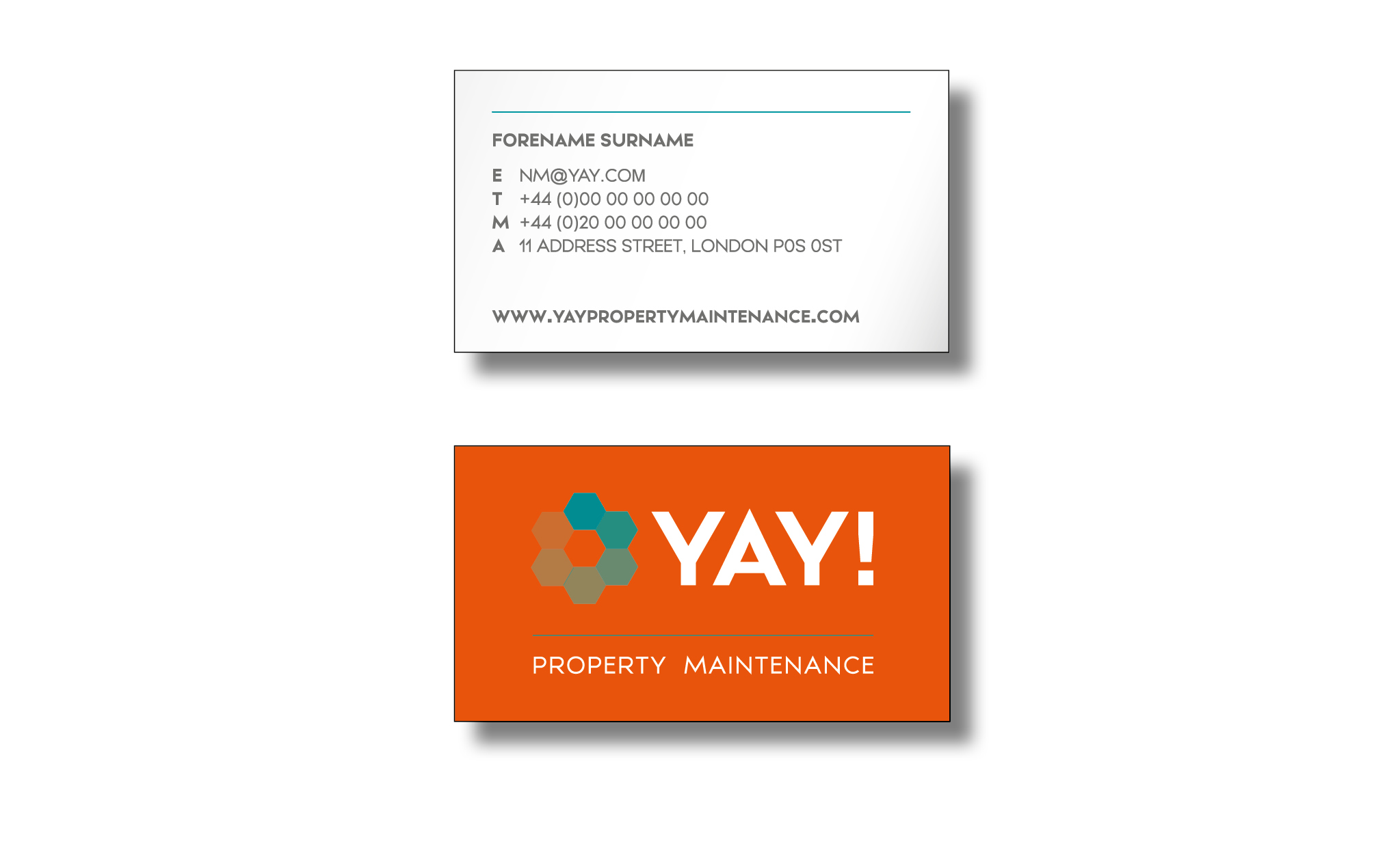
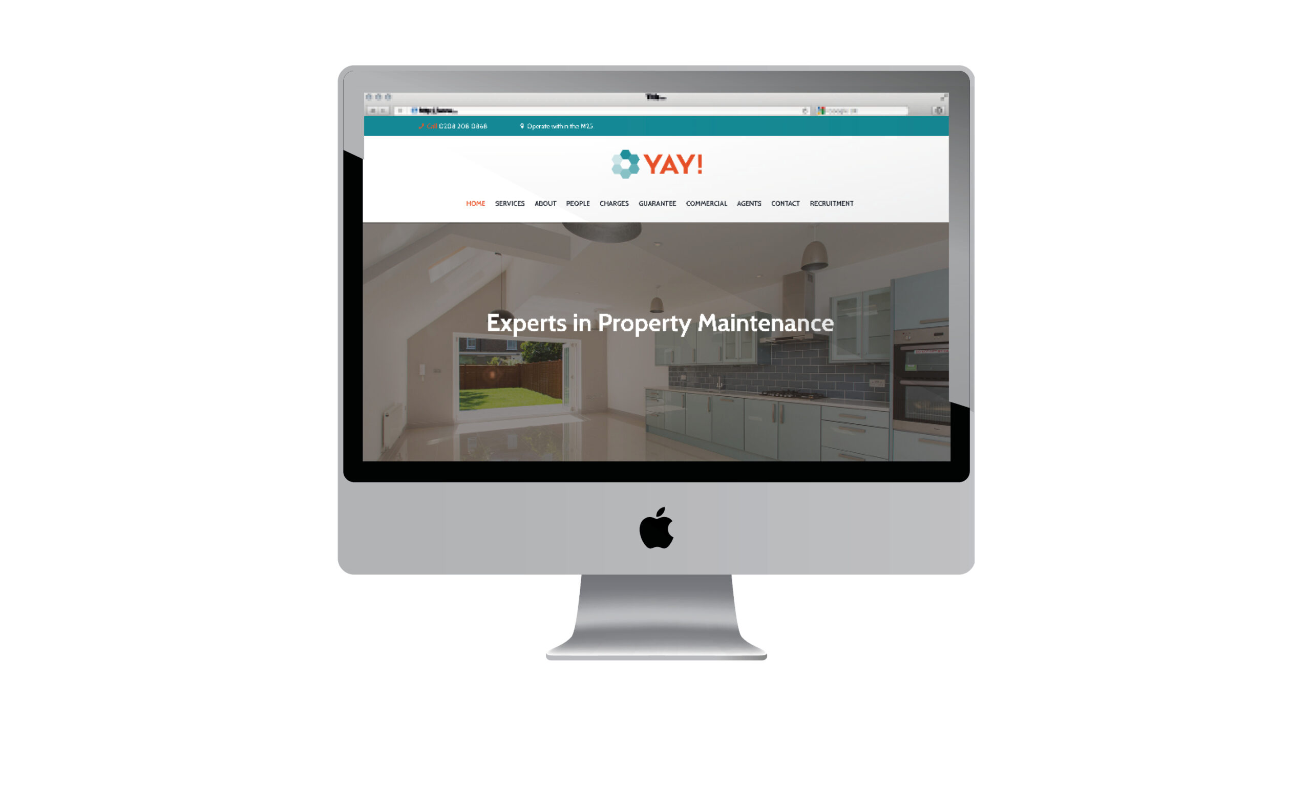
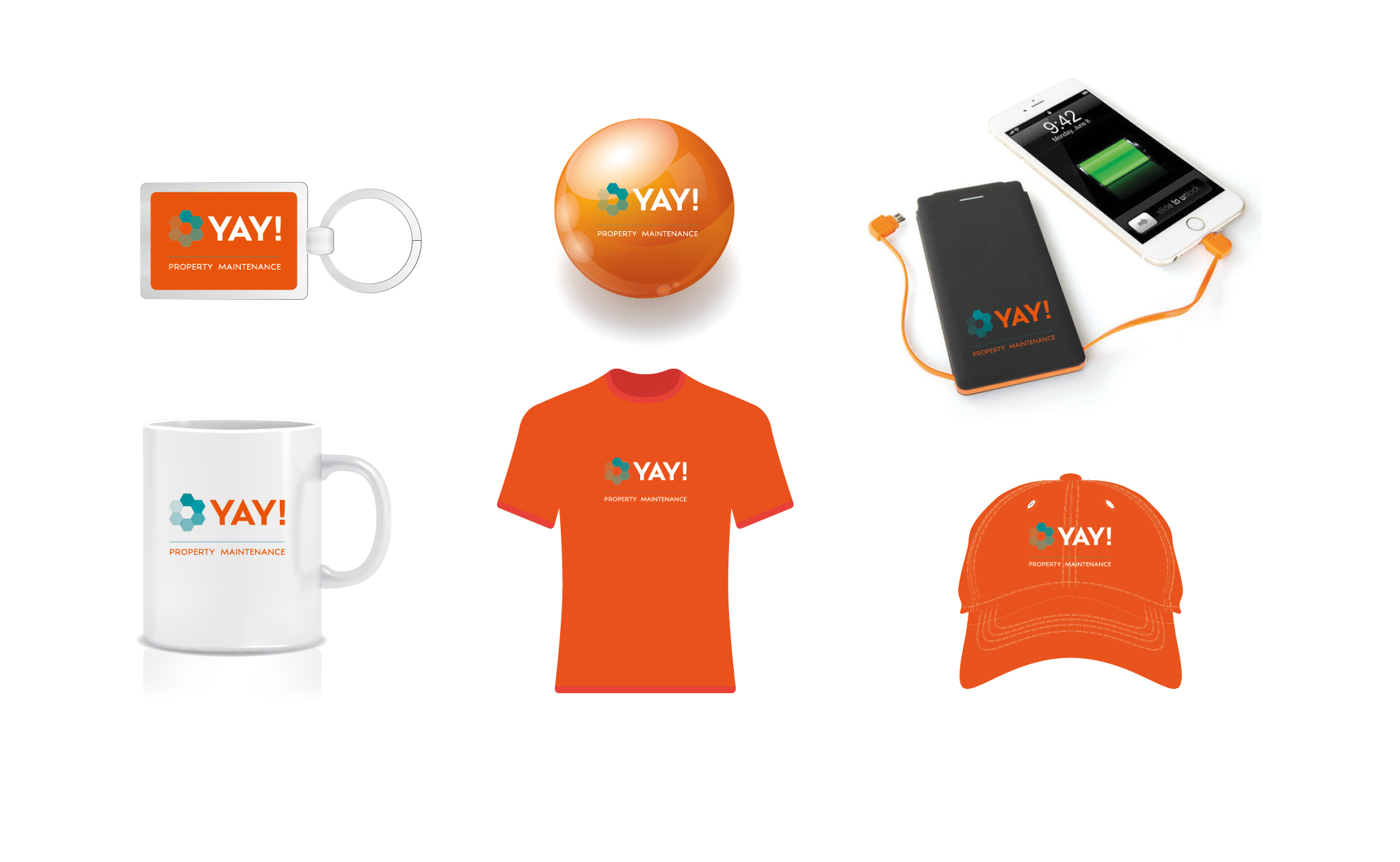
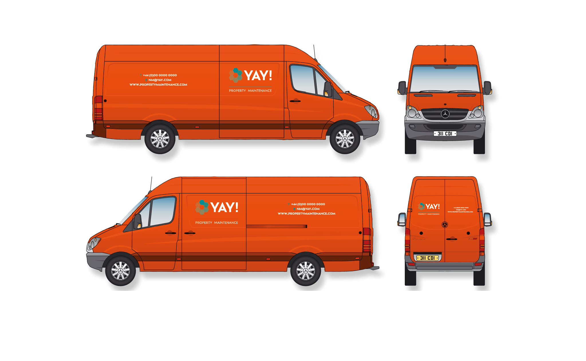
Elements Logo, Brand, Website, Stationary, Vans and Merchandise.
SYNOPSIS
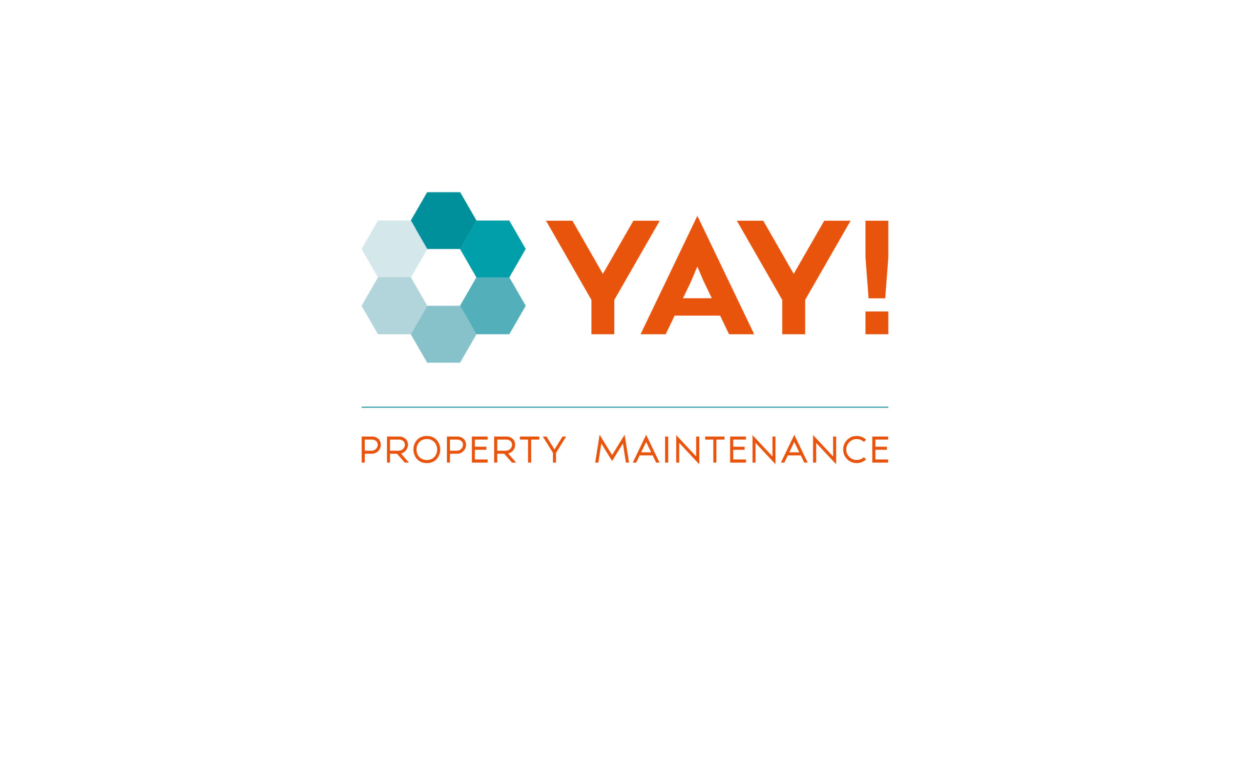
The logo was crafted with hexagons, representing the hive of bees and placed in a circle formation, to illustrate the 24/7 aspect of the business and to appeal to females with a ‘flower’ icon. The brand font placed with the logo, is strong and bold to represent the Property, with character to represent Friendly and simple to represent Professional and sans font used as a primary font for the material, portrays the Friendly and Professional aspect of the business, with the ease of reading. The brand colours orange and aqua was selected for visibility when visiting sites and to represent all of the qualities.
The website encompasses the brand, with the use of project imagery. It has provides the ability for customers to make bookings and showcases their services and staff. The stationary is designed for information clarity, that echoes the brand, that also high visibility. Vans and merchandise are all crafted for high visibility, whilst encompasses the brand.