SYNOPSIS
The logo was designed to represent a production line of trains, illustrating the exact design of the train being produced. The brand was designed to be strong and simple for clarity and not to conflict with four investor brands, whilst being distinctive from its competitors, the brand colour red was chosen as a representation of speed. The chosen typeface is modern, to represent the trains innovative design.
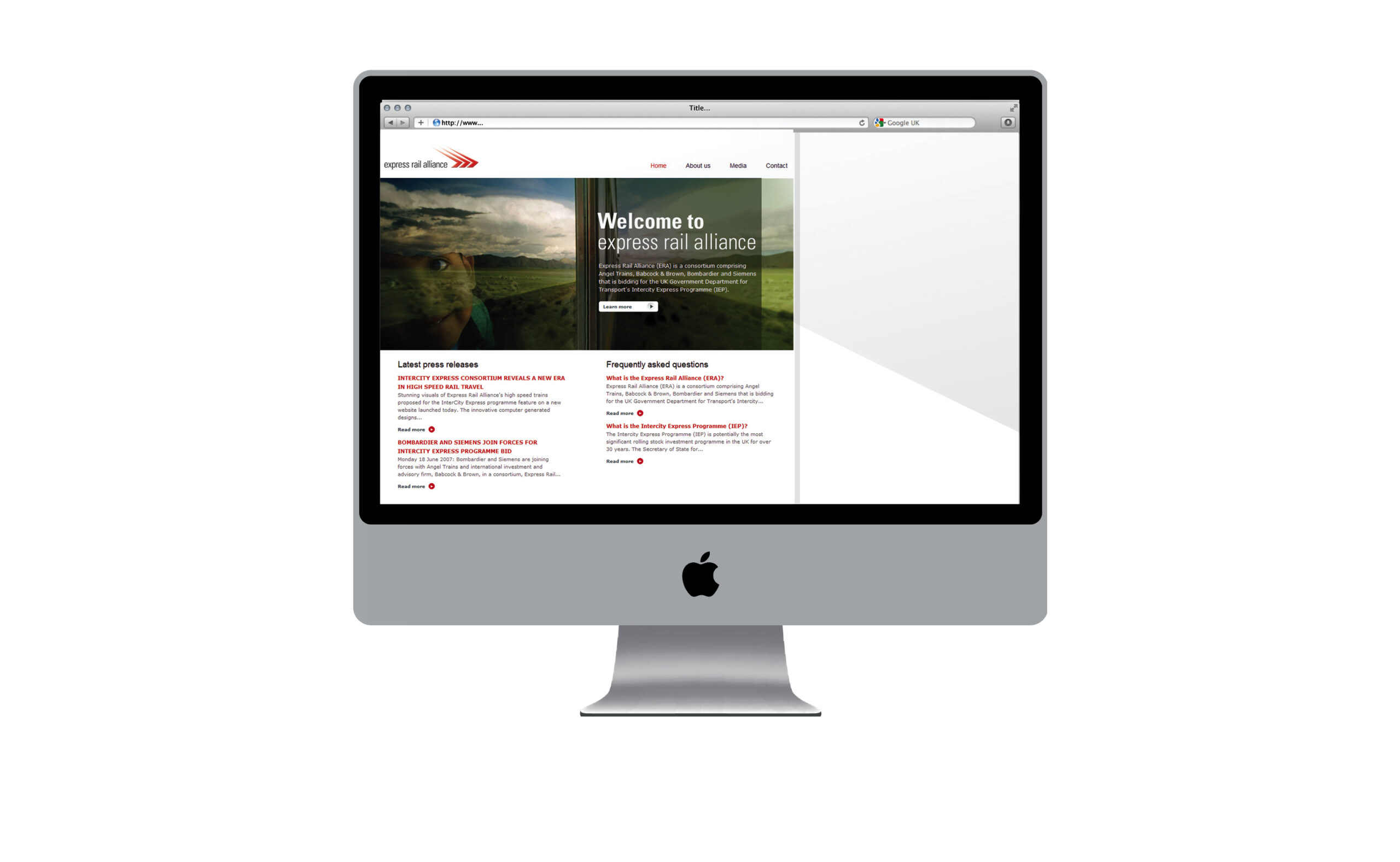
The website illustrates innovation and eco-friendly, through an image of a child on a train with green surroundings. The sub pages carry the brand red bar, creating form and elegance, with clarity of information and easy usability.
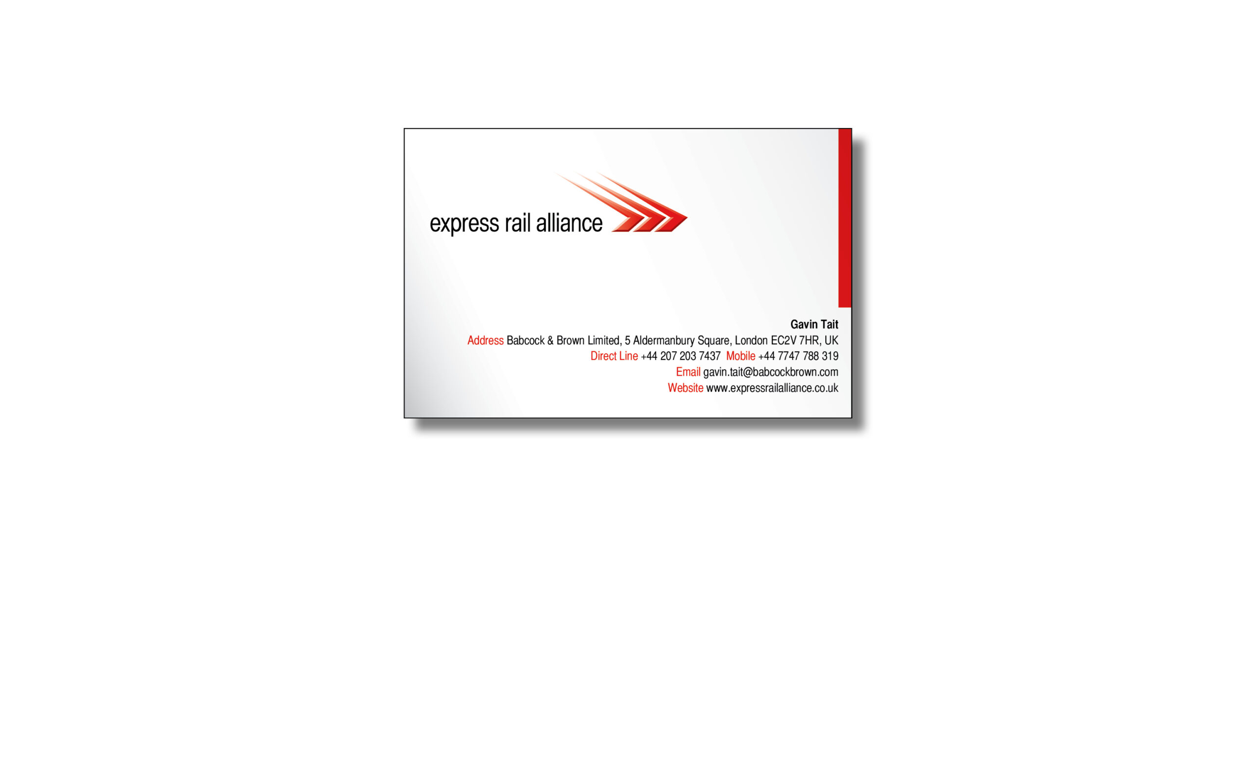
The stationary continues this brand red bar, creating form and elegance, with clarity of information.
The brand was satisfactory to all of the companies and showcased the trains, this instilled confidence in potential investors.