SYNOPSIS
The brand is designed to be understated, with integrity, to illustrate that its priority is working the environment and its people.
For these reasons the logo is designed in grey, with a simple typeface and to represent the confidence, professionalism and modern outlook for its audience and potential investors, it is crafted in bold and uppercase.
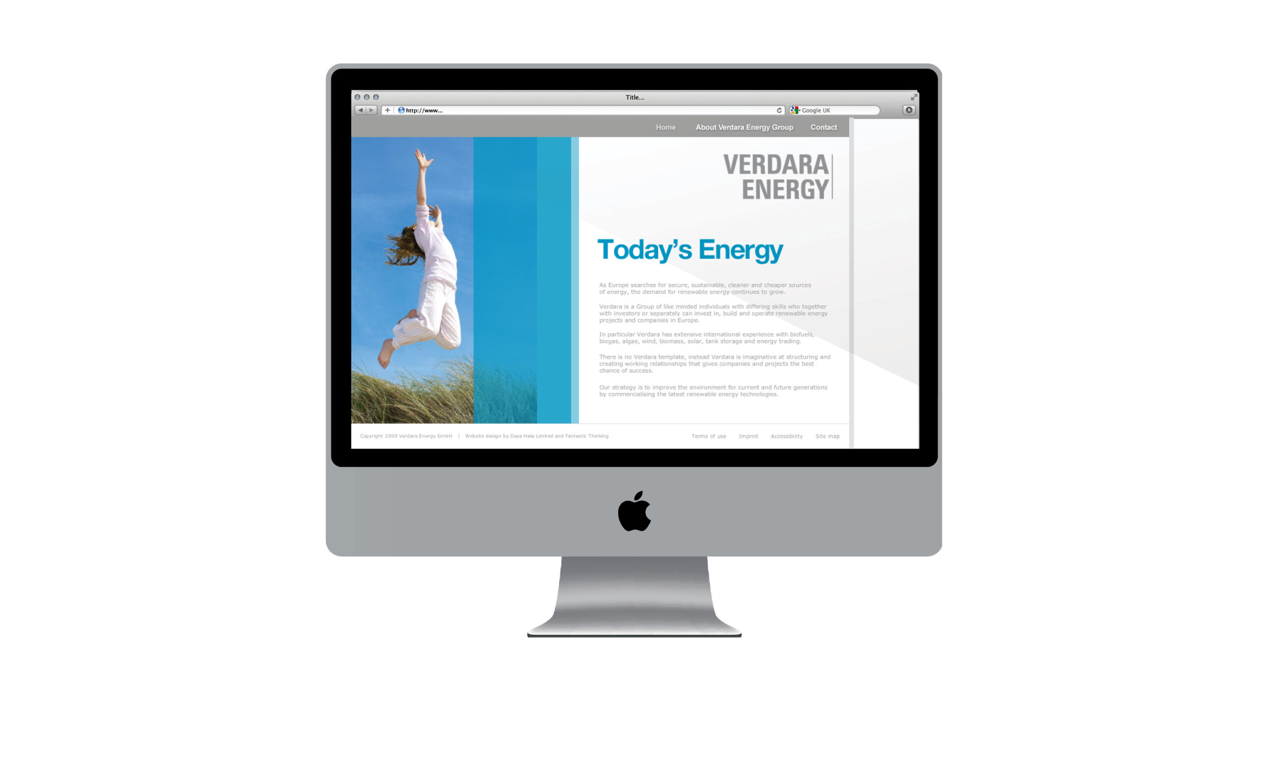
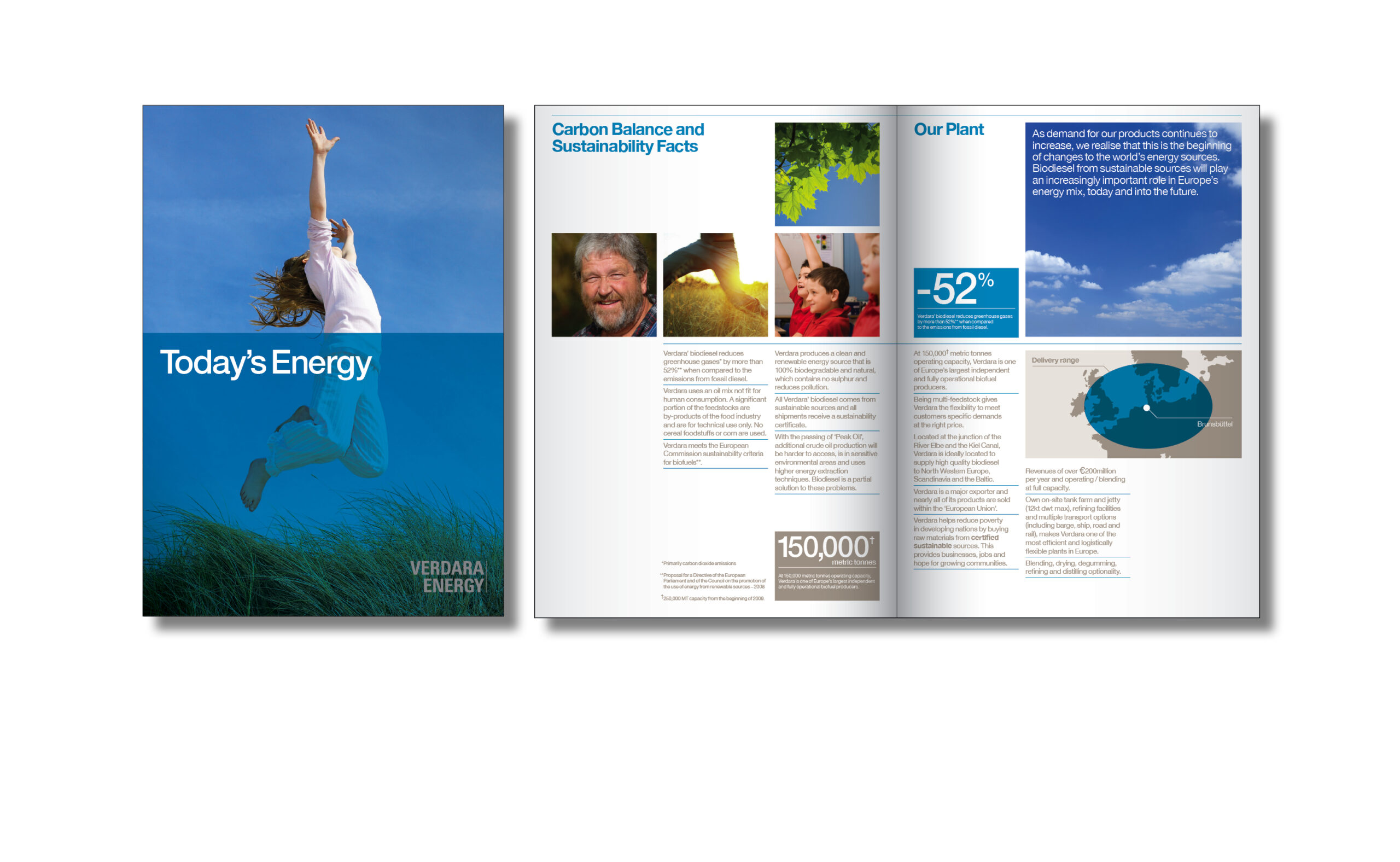
The brochure and website continue the brand values, with the addition of images of children, nature and farmers and with highlighted key facts, to show the performance of the company to potential investors. The page layouts for the brochure are designed for easy readability and visual interest. The website interprets this concept with an animation of colour blocks, with highlighted facts and images. The sub pages and navigation are designed for clarity and easy usability.