SYNOPSIS
The brand was crafted with professional qualities, together with a clean and soft feel. This was crafted with the colours, white and blue to demonstrate the professional aspect and white and orange for the care aspect. This colour scheme was echoed through the selection of images, with stylised imagery, with nature as a concept for care. The serif font for the logo demonstrates the corporate, experienced and boutique aspect of the business and sans font used as a primary font for the material, portrays the Friendly and Caring aspect of the business, with the ease of reading.
The logo icon has a rotation of three cut pentagons, which reflects the well rounded, continuous and solid care service.
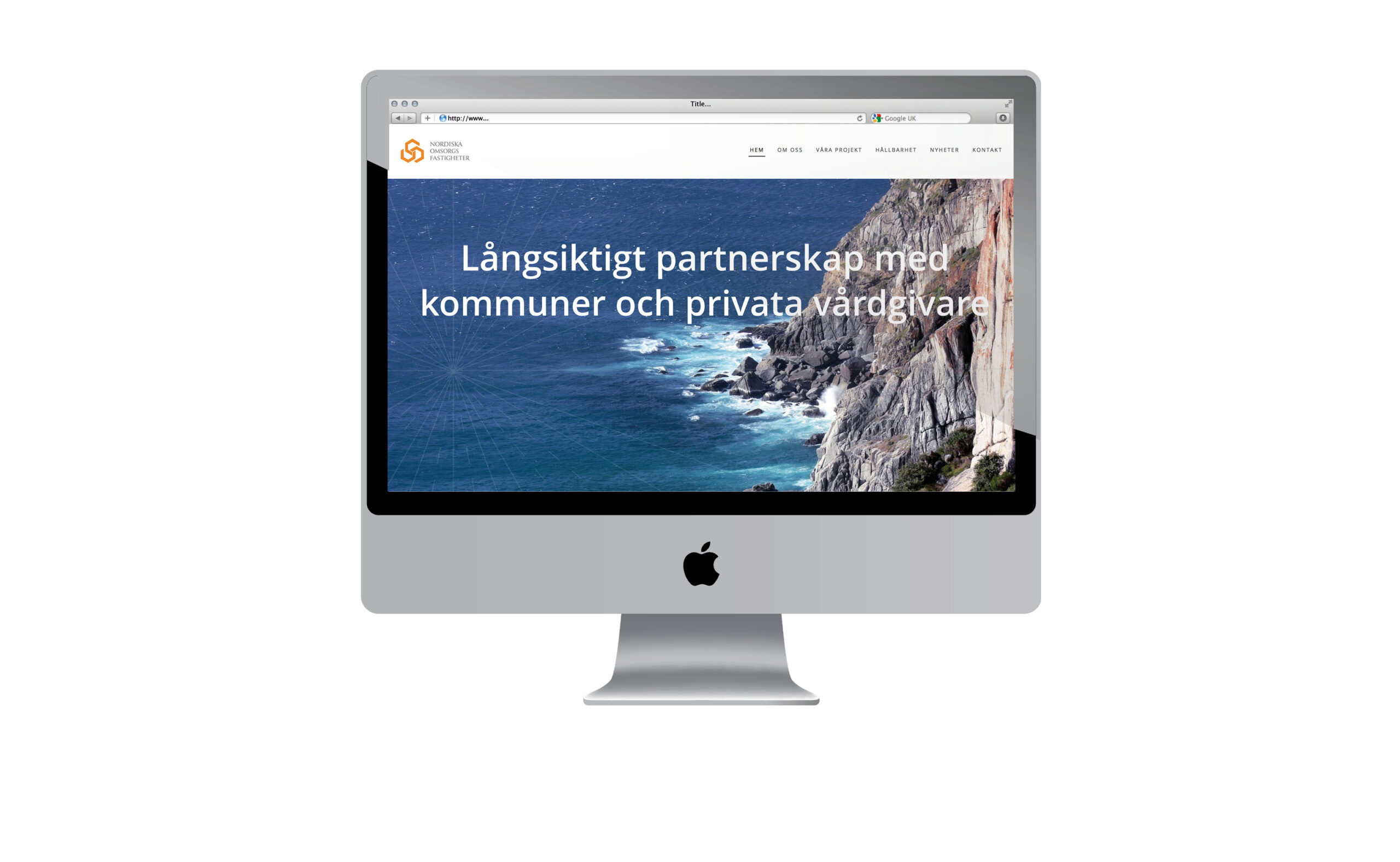
The brand is applied to the website, with the addition of current Projects and News.


